Modern Furniture in Rough Rooms

Recently I came across the photographer Michael Himpel via Lumas Gallery and his shots of beautiful old interiors, all with that fascinating dilapidated but luxe feel, all empty and all belonging to historic villas in Havanna, Cuba.

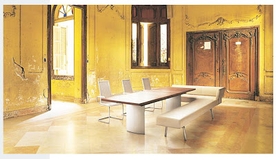
Only little later I saw an advertising campaign of German furniture manufacturer WK Wohnen in print media (February 2008). - And I recognised the rooms! Single modern pieces were placed into these old villas in Havanna for shooting the campaign - in November 2007 with photographer Michael Himpel and Creative Director Christian Follert. The rooms usually are not empty. For the shooting the owner's furniture was taken out. I wonder how these interiors normally look?

See here the photographs with and without furniture :


Villa Eulalia, Havanna by Michael Himpel via Lumas

 
"the charme of past times is present in Havanna ..." via pmi publishing

Villa La Guarida by Michael Himpel via Lumas
What a ballroom !


Villa Carlos, Havanna by Michael Himpel via Lumas
What a ceiling lamp ?!


via Eulalia, Havanna by Michael Himpel via Lumas
What a flooring !! Love the tiles !!


And when writing about advertising modern / luxe furniture in rough / shabby rooms, I want to post two more samples :

red sofa (Charles) above by B&B Italia ...

... in the same room that I  posted it in Feb. 2007 !

However the above picture is not taken from an advertising. If I remember well it was the furnishing of a house in Italy. The style was called "neo-shabby chic" by the magazine it was featured in (Casa International, Beijing).
I do love the fresco !


This is clearly advertising for an Italian divano - the location looks like an abandoned church , similar feeling to the other two pics before.

While the German advertising campaign was this year, I am not sure about the Italian ones. The last (mantelassi) is from about 2 or 3 years ago. However, I do not care if a style is in or not. It has to fit. This shabby chic or rough luxe style just fits to old historic buildings that have a past to tell and to preserve. I hope that I can preserve some interior walls and ceilings in our palazzo in Italy that are testimonies from so many years.

My next post should show some dilapidated walls, ceilings and fresci of our Palazzo Pizzo ...

To round up my recent posts about rough luxe - or shabby chic - I want to provide a few links to some similar content, posted recently or a bit ago, here for the interested reader :

Rough luxe and the new antiquarians by The Architectural Antique Review (09/2009)
Rough Luxe by Wall Street Journal (WSJ, 09/2009)
Rough Luxe Hotel by Designers Block (03/2009)
Cote de Texas about Belgian Design (01/2009)
A description of Boho Modern by Decor8 (01/2008)

Rough Luxe Experience

Some of you and myself are fascinated by "rough luxe" - by the style and the term. And the Wall Street Journal writes "the world of interiors gets a new manifesto".

But where does the term "rough luxe" come from ? How has created it ?

I googled - and found the "Rough Luxe Experience Network", a kind of platform for businesses that "share an understanding of a different definition of luxury".

And there I found this room combining colours and beautiful fabrics with existing distressed original walls :


The photos above and below are all showing interiors of the Rough Luxe Hotel in London, "transformed" by Rabih Hage.


What an interesting bathroom !
 Of course I selected all the bathroom photos as I have to do six for our palazzo.
And I wanted to show the rough part of the rough luxe style - the original walls. For me a bit too much (above).


The "Rough Luxe Network" seems to me like a "Charming Hotel" kind of network that is still new and very trendy. I deem their criteria to become member very interesting. 

Read some interior related criteria here:

ROUGH LUXE NETWORK CRITERIA :

* Unique location of the business in an exclusive site or address (maybe our palazzo's guest appartment should participate !?!) 

* Special or unique architectural and/or historical building where the (Rough-Luxe) business is established or operating from.

* The interior and architectural design are based on the mix of old and new elements; showing original parts of the building, preserving the memory of the site and built environment as well as adding new, useful and original elements to the property.

* The design is based on a mix that looks random but in fact is done with a conscious transmission of social and philosophical messages that put intellectual enrichment prior to the physical well being.

Physical comfort is important. However, it comes second to intellectual exchange of ideas and personal enrichment through the time spent in a Rough-Luxe business.

* Rough-Luxe will only have original art and design pieces (no copies or prints of existing art or design).

* In a Rough-Luxe business: Luxury is original materials with a unique appearance and historical elements not solely rare materials and expensive finishes.

(...) 
----
 
The red section above is exactly what I think is necessary for our renovation of our 200 + years old palazzo !
 
However the grey sectio above means for the Rough Luxe hotel guest that :  "they might share a bathroom or have a small room or a small shower cubicle, but the luxury is in the choice of the wine, the bed linen, the art on the walls and the people looking after you." (o-tone hotel website).
 
Sharing bathrooms is not really what I like to do when travelling...  but I am fine with the rest.
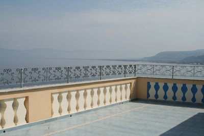
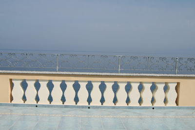
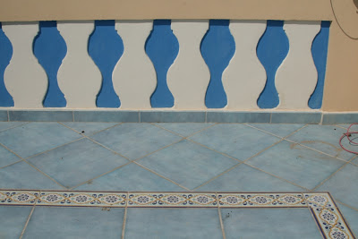
Terrace : Amalfi Style


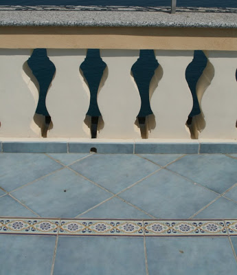
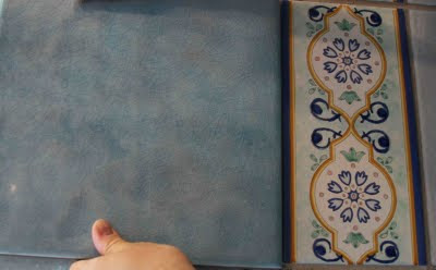
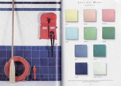
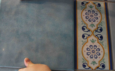
The water blue tiles (color Zaffiro, serie Emozioni) and the listelli, that make the decorative border are both from Fornaci d'Agostino in Salerno. This company is one of the well-known producers of famous Vietri ceramics (Ceramica di Vietri). The ceramic's name comes from the small village Vietri Sul Mare with its many ceramic crafters, located close to Salerno at the East of the Amalfi coast. The beautiful colorful ceramic tiles became famous together with the picturesque dream destinations Positano at the Amalfi coast and the island of Capri.

With all these mouthwatering names and links, I am sending you some warm and sunny greetings from Italy. Happy day !

Vietri Ceramics for Mediterranean Style


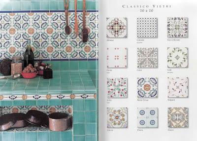
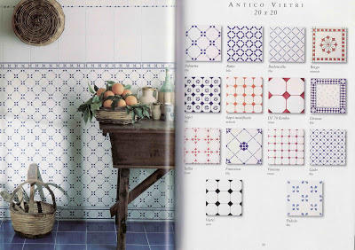
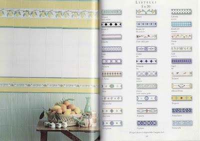
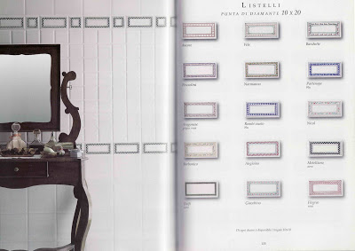
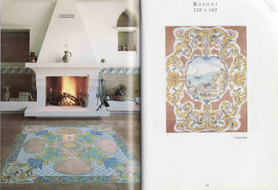
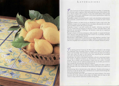
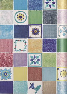
When in Italy we had to choose tiles for the balcony and terrace. This was when I learned about the colourful Vietrese ceramics (Ceramica di Vietri) that spread instantly Mediterranean atmosphere. I am sitting here and browsing through the beautiful catalogue (215 pages!) from Francesco de Maio, one of the famous producers of Vietri ceramics. I just wanted to scan the most beautiful pictures but also show the variety of colours, shapes and sizes they offer. So I have a total of ten pics:


Vietri tiles make your kitchen look rustic. It feels like being on holiday everyday.


Listelli are the decorative borders you can add for a perfect look. In the kitchen (above) or in the bathroom (below).


The blue bathroom above shows perfectly the way Italians use different shapes, sizes and colours of tiles to create a unique pattern. You can do the same at home, no need to have Vietri tiles.

For our balcony and terrace we choose similar unicolored tiles, kind of water-air-colour from Fornaci d'Agostino (see picture below).


Of course you can also order panelli, different Mediterranean motives to decorate your walls in the kitchen or in the garden.


And you can have motives for the floor. Above two examples to use for a terra cotta tile floor.


There is no limit for fantasies. You can use Vietri ceramics for your table. Perfect for the garden, rain and sun resistant. Above the very classic colours yellow, blue and green - and on the right a more modern fresh alternative.

(If you want to know about the production technique click on the above picture, the English text is on the right below.)

Have a great weekend and thank you for dropping in.

- All pictures from Francesco de Maio catalogue 2005, Salerno, Italy -

---------------
And once more the picture from our future terrace tile with matching listello, both from Fornaci d'Agostino.

Mood Board for our Project

Thanks to Holly Becker's 'Mood Board' contest on Decor8 I finally pushed myself to create a board for our palazzo project. It should help to define the right style for the house.

Here is what inspires me:


Here some more details from the board:


Shells in shells. That's how I could place our shell collection somewhere.


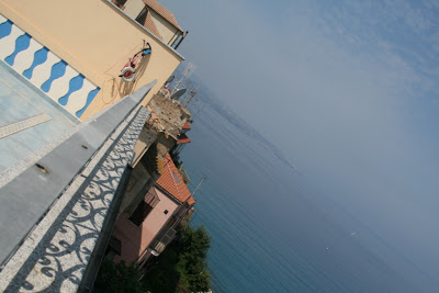
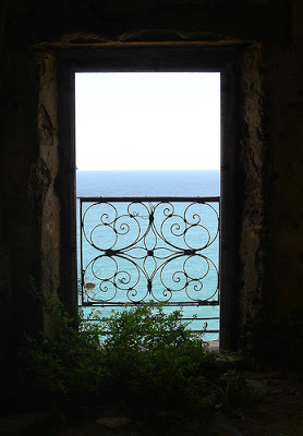
Sea view from the garden floor with iron gate.


Fresko over a door, painted by reputated painter 'Carioti', who has last lived in the house until he died in 1997.


Bouganvilla and cactus plants at the Restaurant Go, near Pizzo Calabro. That is how I picture my tiny garden on the rock.

Actually, the renovation has not started yet. Architects were supposed to make proposal, but nothing has happened in the last six month. Of course the main problem is that at the moment we are based on the other side of the world. However, my father-in-law will be on site in the next days and kick-off the thing. He will be there until we arrive in mid-July for a three weeks summer holiday.