Before and After: How a tiny 2,6 m2 overhanging Toilet became a pretty Kids Bathroom


A bit over a year ago, I was planning the tiny overhanging bathroom that measures 1,4 m x 1,9 m (2,66 m2). Originally it was just an "outhouse" with a toilet, a bidet and a sink. But we wanted to install a shower - in order to have an "en suite bathroom" for our son's room.

And I have to say, I am really happy with the outcome!
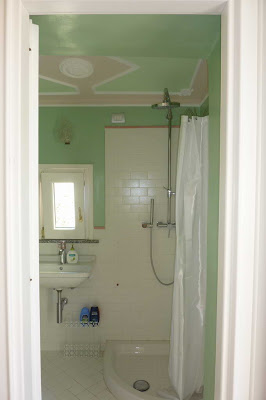
tiny kids bathroom 2,6 m2

I had told Angelo (our "capo" and my father-in-law) that his grandson would like to have a "green" bathroom. And, that I like "subway" tiles. I designed the tiling for the floor and the walls. Angelo over exceeded our expectations by adding a stucco ceiling (that was not there originally)!

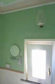
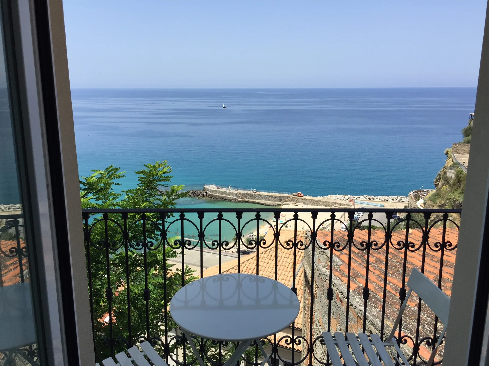
Since the sink is right below the window - where you have a nice view in the neighbours garden and over the sea - we needed to have the mirror installed beside the window.

Our young son does not use a mirror so far... So, I do not know whether this beauty mirror is too small or not. But it looks nice! It has the right size for this bathroom.
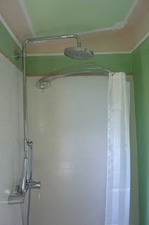
shower area 80 x 80 cm

If you wonder why we have a rain shower installed in such a small bathroom, then because we probably made a mistake when ordering the shower equipment back in China, where we were living at some point - a couple of years before this bath renovation.

But we were lucky, it just matches the height.
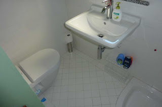
  small compact toilet
For the sink, I researched online the different sizes available for different models. At the end I choose a Duravit Strack 3 model, they have a lot of options. It is important for a small area to choose the largest possible sink - as it is a hassle to wash hands in a sink that is too small.

I even asked Angelo to sit down on the toilet (that was already delivered) and measure the space between his knees and the wall to make sure, there is still enough space between toilet and sink.

The two short blue tubes that stick out of the wall next to the toilet are the pre-installation for a water spray. In Italy it is common to use bidets in private bathrooms. But with the installation of the shower we really had no more space for a bidet. So we opted for the space saving water spray - yet to come.

The floor tiles are layed diagonally in order to optically strech the room.

"spider" shower curtain holder and "fish" hooks
In a shop in Vibo Valentia, we found these green "fish" hooks. There were only two left and I bought them. Angelo fixed them behind the bathroom door. In another shop I found the "spider" that is a space saving Italian solution for hanging the shower curtain.


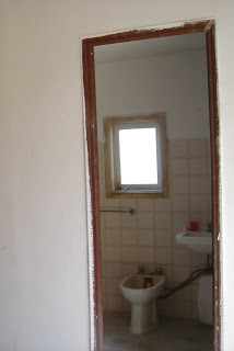
And here is the old bathroom, BEFORE renovation, as we found it when we bought the house:
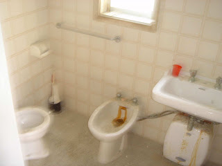
BEFORE toilet with bidet
The toilet itself was also very tiny before and squeezed into the left corner. The bidet was eliminated for our new bathroom layout. The sink was moved below the window to give space on the right corner for a small shower.

BEFORE renovation
The only thing that was bigger in this bathroom before the renovation and became smaller after the renovation, is the window! Strangely, the window frame is so massive that the new window is much tinier. Well, these are things you encounter when renovating, whether you are on site or thousand of miles away.

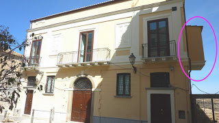
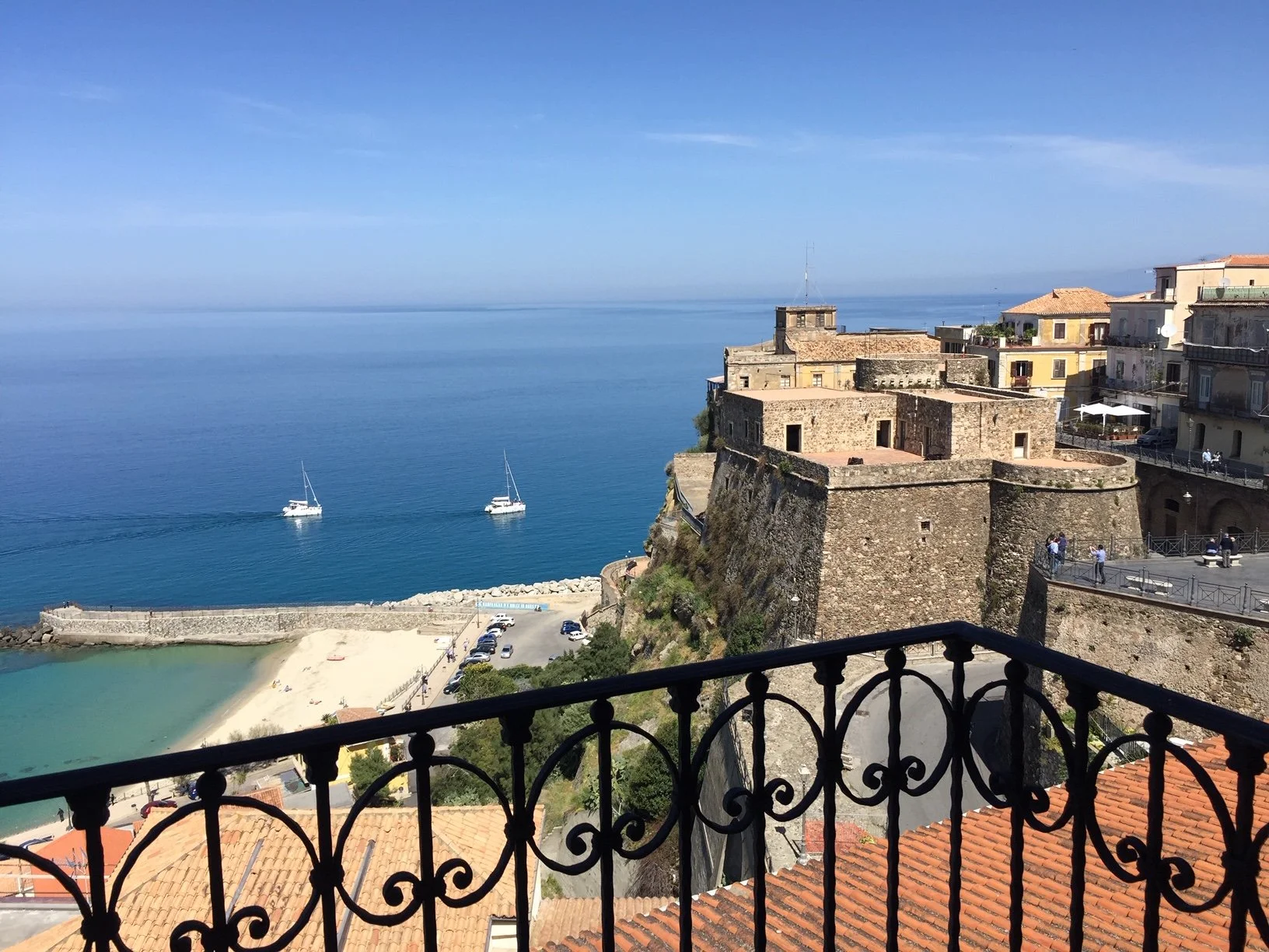
"outhouse" or overhanging bathroom
Our palazzo is over 200 years old, and at that time an outhouse toilet was common in European cities. You can still sea the remains on the side of many palazzi in Italy. But of course the toilets nowadays are linked to the public canalisation.

Colourful Folly


From Angelo's pictures that he had sent via email I knew more or less how colourful the house would be. But he did not send me pictures of every corner .... he left surprises for us.

When I entered the house again after three months absence, I felt like Alice in Wonderland... And while opening and unpacking the last boxes and walking ten, twenty times in and out of the living room, I started to feel dizzy. Was this the summer heat - or was this the impact of all those colours?

I imagine painting so many walls and ceilings day after day, all alone, must have become more and more boring for Angelo. And I can imagine how he tried out one colour and another colour. He must have become more and more frantic when shopping for colours - it must have been a kind of colour flush that had overcome him!

"Colourful Folly", I thought, must be the title of a post to honour this work, conveyed from the German expression "der helle Wahnsinn", that leo.org translated into "plain folly".

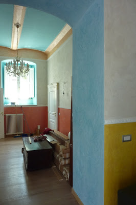
I count seven (!) different colours

(the blue of the ceiling is different from the blue in the arch (which also is spatolato technique) and I counted the white (border, doors, radiator) as one colour.)


I have some chairs to upholster with some not yet choosen fabric... I guess it need to be very neutral fabric ;-) ... Usually I prefer white walls and play with colours of fabrics, paintings, ceramics, flowers etc. But okay, Angelo was our painting master in charge and this is the South of Italy. Lets first move in and see how it feels. Before getting crazy, I might have to find a brush, as Angelo always says...

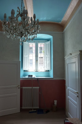
the sunlight makes the colour of the window alcove shine brighter 

A Bathroom Vision in Blue

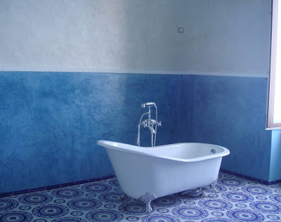
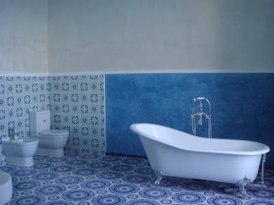
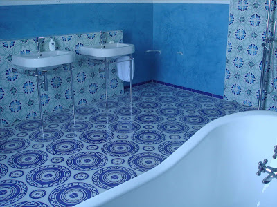
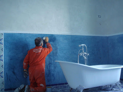
A dream of a bathroom! How colours can change the atmosphere! Actually it is not just painted blue walls, it is spatulato, a Venetian technique for making painted walls shine like marble.

a vision in blue

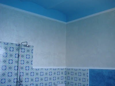
blue and pearl grey wall colour harmonizes two different pattern of Vietri tiles on wall and floor

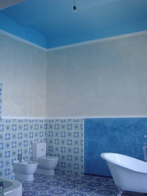
the lighter blue of the ceiling matches one hue of the wall tiles

the wall paint reduces the strong contrast (see before here and here)

stucco borders frame the painted areas

view from above (while painting the ceiling)

beautiful perspective of a blue bathroom dream

A "specialist worker" waxing the surface of spatolato finish in order to obtain a surface similar to polished marble.

Bath room with spectacular sea view

I wish I could be there! I have not seen it in reality yet. I only have these photos for now and have to wait for summer. 

What a dream in blue!

Grazie Angelo!! You are becoming the new Michelangelo with this project! Thank you for choosing the right blue and for spending so much time on the spatulato technique.

Stunning entrance room with Chandelier

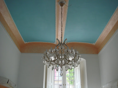
Bohemian crystal chandelier and another blue ceiling

Angelo surprised us with an impression of the entrance room.
LC, my son, and I were speechless starring at the screen of the computer when the picture opened up. Not only the chandelier, that is a gift from my mother-in-law, who found the chandelier one day on the street (!) slightly dammaged and with missing parts and had it restored, but also the choice of blue that Angelo painted on the ceiling - both together looks so stunning! Angelo said he mixed colours we did not use in the living room (see colour testing in the living area) and tried out different shades until he was happy with the result. I am very happy too!

Stuning surprise again, GRAZIE !
Looking forward to the master bathroom surprise coming tonight via email...

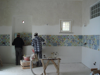
Oh my God ! My crazy Tile Mix turns out Sensational !

I LOVE IT !!! Grazie Angelo, Tonino & Mimmo, baci a tutti (even if you don't like it) ! I am so happy to see the fantastic result !


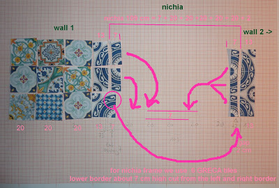
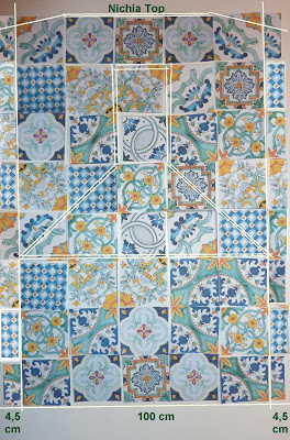
Since the tiles have arrived yesterday, I knew, there is a chance that Angelo sends me first impressions of the crazy mix during lunch break in Italy. I was so excited and could not wait to see it. I am relieved how beautiful, how bright and colourful "my mix" looks like. I worked hours on it with tiny paper tiles deep at night... Grazie mille for following "my design"! (was someone swearing about the work?)

I am looking forward to see more pictures soon.
Meanwhile, I will show the photos that were used as model today:

wall no 1 - and "frame" for niche (coming)

wall no 2

wall no 3

wall no 4 - the wall inside the niche

For the entire mix I ordered seven different types of Vietri tiles. - The sales woman at Callipo who knows us well since the start of the renovation was not very convinced. - Each pattern came in a box of 25 tiles, equals 1m2. As I did a calculation mistake I had to include 8 left over tiles from a pattern we used in the masterbath. And additionally I created a kind of frame around the niche (which will show later) out of another 6 left over tiles from the bath.

In total, the workers had nine (!) different boxes to select the correct tiles from, one by one according my master plan. I am very happy they did not refused to do so ! ;-)

And if Franceso de Maio wants to copy that mix for their new catalogue they can name it "Palazzo Pizzo" since I have a copyright now!